Tooltips
Sometimes it is beneficial to put context-dependent help on specific UI items using the common tooltip mechanism. The MDI apps framework provides functions for adding standardized tooltips to UI elements by id.
Adding tooltips from server functions
The following code block shows the call structures that can be used to add a tooltip to an existing UI element from within a module server script:
addMdiTooltip( # a single tooltip
    session,
    id,
    ...,
    asis = FALSE,
    lineWidth = 35
)
addMdiTooltips( # multiple tooltips added at once
    session,
    tooltips,
    ...,
    asis = FALSE,
    lineWidth = 35
)
where:
- session = the session object of the calling module
- id = the id of the UI element that the tooltip is attached to
- tooltips = a list of tooltips, each as character(id, title, [lineWidth])
- … = tooltip options from https://getbootstrap.com/docs/4.0/components/tooltips/
- asis = use
iddirectly, not assession$ns(id) - lineWidth = nominal number of characters per tooltip line
for example:
# <moduleName>_server.R
addMdiTooltip(
    session,
    id = 'elementId',
    title = 'Important information about the element',
    placement = "bottom"
)
Importantly, addMdiTooltip() will fail silently if the target element has not yet appeared in the web page - the element must already exist for the browser to add a tooltip to it. For example, you must call addMdiTooltip() after insertUI(immediate = TRUE).
Adding tooltips from within renderUI expressions
Slightly different handling is required if you wish to add a tooltip along with a UI element during a call to renderUI(). Do this using mdiTooltip() - note the difference in name from addMdiTooltip():
mdiTooltip(
    session,
    id,
    title,
    placement = "top",
    asis = FALSE,
    lineWidth = 35
)
where:
- session = the session object of the calling module
- id = the id of the UI element that the tooltip is attached to
- title = the content of the tooltip
- placement = where the tooltip should appear (top, bottom, left, right)
- asis = use
iddirectly, not assession$ns(id) - lineWidth = nominal number of characters per tooltip line
For example:
# <moduleName>_server.R
output$myOutput <- renderUI({
    tags$span(
        ...,
        mdiTooltip(session, "elementId", "information about the element"),
    )
})
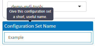
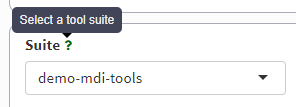
Adding help icon (?) tooltips to Shiny inputs
It is rarely a good idea to put a tooltip directly on Shiny inputs, e.g., textInput(), as you do not want popups to appear every time a user interacts with an input, only when they want help.
The apps framework provides the addInputHelp() function to add typical ? icons to an input’s label whose sole purpose is to provide context-dependent help.
The call structure is:
# <moduleName>_server.R
addInputHelp(
    session,
    id,
    title,
    lineWidth = 35
)
where:
- session = the session object of the calling module
- id = the id of the Shiny input that the tooltip is attached to
- title = the tooltip text
- lineWidth = nominal number of characters per tooltip line
for example:
# <moduleName>_server.R
addInputHelp(
    session,
    id = 'selectInputId',
    title = 'Information about the data to be selected'
)